
Walk down any cereal aisle at Walmart or Target, and you’ll see something’s changed. The boxes look different now. Bolder. More creative. Way more interesting than they were a couple years back. Cereal brands finally get it—packaging sells products just as much as what’s inside.
Here are the top design trends making cereal boxes disappear from shelves in 2026.
Bold Colors That Grab Your Attention
Forget those boring, safe colors. Today’s cereal boxes scream for attention with electric blues, hot pinks, and neon greens. Brands dump the muted stuff because nobody notices it anymore. When you’ve got hundreds of options fighting for space, you need color that pops.
Kids go crazy for these bright boxes. Parents spot them too. Our brains just react faster to bold, saturated colors. Brands know this, and they use it.
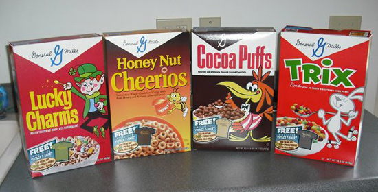
The Retro Revolution
Old-school designs are everywhere right now. Cereal companies bring back vintage looks that remind you of Saturday morning cartoons from decades ago. We’re talking 1970s fonts, classic mascots in their original glory, and packaging your grandma would recognize.
This stuff works because it hits you right in the feelings. You see that vintage box and boom—you’re eight years old again. That’s powerful enough to make you grab the box without thinking twice.
Transparent Windows Show the Real Deal
People want proof. Clear windows on cereal boxes let you see the actual flakes, loops, or clusters before you buy. No surprises when you open it at home.
Shoppers trust what they can see. When a brand shows you the product upfront, you feel better about buying it. Simple as that.
Minimalist Designs for the Health Crowd
Some boxes go the opposite direction—super clean and simple. Lots of white space, basic fonts, and ingredient lists right there on the front. No mess, no confusion.
This look targets health-focused shoppers. These designs tell you this isn’t some sugar bomb marketed to kids. This is real food for adults who care about what they eat.
Your Favorite Characters Are Back
Remember Tony the Tiger? Toucan Sam? Lucky the Leprechaun? They’re taking over cereal boxes again. And brands keep creating new characters that feel like old friends you just haven’t met yet.
Characters sell cereal. Always have, always will. Kids beg for the box with the cool mascot. Adults smile at the familiar faces. Everyone wins.
Going Green Matters Now
Cereal boxes shout about sustainability these days. You’ll see “100% recyclable” badges everywhere. Brands brag about plant-based inks and sustainable sourcing right on the front panel. Shoppers at Walmart and Target actually look for this stuff now.
The boxes themselves changed too. Thinner cardboard, less plastic, materials that break down easier. Companies like Boxprinting4less help brands make this switch without losing that shelf appeal.
Boxes That Do More Than Sit There
QR codes turn cereal boxes into interactive experiences. Kids scan them and unlock games or augmented reality adventures. Some codes take you to recipes or exclusive content.
Your cereal box becomes entertainment. The brand stays in your head long after breakfast ends.
Touch It and Feel the Difference
Raised logos, bumpy patterns, textured finishes—these boxes feel expensive. You pick one up and it just feels different from the others. That tactile thing sticks with you.
Premium cereal brands love this trick. Better packaging suggests better cereal inside. Shoppers make that leap every time.
Grab and Go Wins
Those little single-serve boxes are everywhere now. Perfect for one person, one breakfast, done. The designs pack the same punch as the big boxes, just smaller.
Americans eat on the run. These portable packages match how we actually live in 2026.
Breaking Out of the Box
Some brands ditch the rectangle completely. You’ll find hexagon boxes, cylinders, weird custom shapes that make you stop and stare. They cost more to make, but they get noticed.
These unusual shapes look great in photos too. They get shared on social media. They create buzz. Sometimes that’s worth way more than saving a few cents on standard packaging.
Wrapping It Up
Cereal packaging has become serious business. The brands crushing it at Walmart and Target know their box is a billboard, a promise, and a first impression all rolled into one. Bold colors pull eyes. Retro designs pull heartstrings. Clear windows build trust. Minimalist looks signal quality. Each trend serves a purpose, and smart brands mix and match them to connect with shoppers. In 2026, your packaging tells your story before anyone tastes a single flake. Get it right, and your cereal flies off the shelf. Get it wrong, and nobody even sees you there.
 :
https://www.pinterest.com/boxprinting4less/
:
https://www.pinterest.com/boxprinting4less/